
The longevity of Mascots
From simple symbols of luck to powerful branding tools that shape consumer behavior, the journey of mascots is a fascinating one. This article explores how they became persuasive forces in marketing and why they've seemingly declined in today's fast-paced digital world. Read on to discover why brand mascots are no longer the marketing staples they once were.
BUSINESSMARKETING
Shrey Padhi
8/1/202411 min read
De-coding the roots
It is quite uninteresting to note – much like most of the sophisticated words in the queen’s tongue (or shall we refer to it as the king’s tongue now?) – the word “mascot” originates from French. In the 19th century, this word was used to refer to inanimate objects which could bring about good vibes. In the late 19th century, in a recorded college American football match between Yale and Harvard, a bear cub (source 1) was introduced on the side-lines to cheer for the players and hustle up the crowd. Despite the heavy violence of the game dominating the headlines (source 2), sources suggest that this seems to be an origin story for the role that mascots would play in shaping consumer behaviour for years to come.
Whatever other contemporary debates on the true origins of mascots may be, common lines can be drawn about mascots being the mainstay at sporting events from the late 19th century to the 20th century. Indeed, historical notes suggest that mascots were popularized by various sports teams worldwide (source 3). During this era, mascots went from being associated with pathetic fallacies to living animals dressed fancily in their team’s colours cheering for its players just like a fan.
These animals represented the entire community which was behind the players, in the stadium, providing love and support for the players. As noted earlier, these players more often than not got into frequent brawls with each other, especially in high-contact sports where the risk of getting injured and consequently injuring another was very high. The fact that sporting equipment was abysmal and impractical, and often designed with little to no exception for the safety of the players, certainly did not help the cause of controlling on-field & off-field behaviours. It is important to note that during this stage, sports itself was in an iterative stage, with many rules and regulations still undecided, and teams often opting for a strategy of “invent as you go” – when it came to on-field controversies.
As the team evolved, its mascot became a pivotal stakeholder in every game that was being played throughout the year. They funnelled the emotions of the players and the fans alike (source 4). In a newly discovered manner, and quite idiosyncratic for that time, mascots started to represent consistency in sports. Irrespective of the outcomes of the final game, a cute dog running around the field was bound to settle some of the emotions.
The playbook
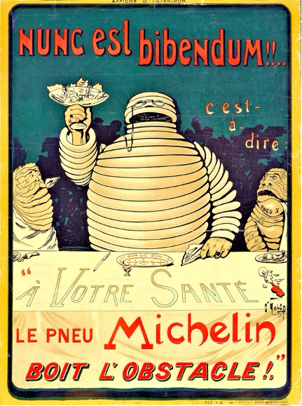
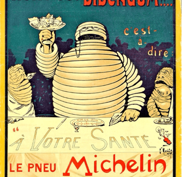
The use of mascots as elaborate strategies by brands to persuade consumers was not as widespread during the late 19thcentury as it was in building brand personality. This is clear from the way mascots were being popularly used for various sporting events. However, there were brands such as Michelin’s The Michelin Man that were constructed to represent the personality of the brand. Perhaps, this was one of the tipping points that introduced the world to the power of a mascot’s longevity and the ability to leave a lasting impression on a consumer – ultimately resulting in a tremendous brand recall.
It is widely accepted, that The Michelin Man which represents the brand in over 170 countries (source 5), and is currently one of the longest trademarked logos of all time (source 6), is recognizable by 90% of the world population (source 7). This is a classic example of an elaborate strategy of brand representation that continues to outlive dynasties and empires, even sailing strong and riding waves of revolutions – political and technological alike.
Dissecting The Michelin Man’s characteristics provides a handful of insights towards how much influence a chubby man, made out of tyres, garnered for the next generation’s mascots. Bibendum was the name The Michelin Man was initially referred to with. This word simply means “To Drink” in Latin. Legend has it that the derivation of the name was a spin-off from Michelin’s competitors passing comments after it was unveiled (source 8), some suggest that the name came because in the early iterations of the mascot’s design, The Michelin Man was holding a glass with nails, nuts and bolts – which incidentally looked like a glass of alcohol. Indeed, the earliest iteration of the design was a rejected design of some brewery in Germany.
This portrayal of Michelin’s brand – where their mascot is ready to drink out of a goblet filled with nails, nuts and bolts (all that can puncture a tyre) – as one of the most resilient tyre companies in the market ingrained a remarkable brand position. It is worthwhile to note that as Michelin released other business avenues, the mascot adopted newer designs. With the introduction of the world-famous Michelin Guide – a guidebook that was released to make road travel popular – The Michelin Man adopted a more luxurious lifestyle, often being seen dressed elegantly in waistcoats and breeches.
Throughout the years, The Michelin Man was re-designed to match the unique propositions of its parent company. As the company adopted a more family-friendly brand position, the mascot also changed into a more lean and sober-looking man as opposed to the slightly insatiable and gluttonous-looking old man (source 9).
However, Michelin’s efforts to reach a wider audience didn’t stop at a simple change in looks. The company made large strides in working with popular culture and integrating their designs into children’s books and cartoons, one of the popular unveilings of the mascot was in the kids’ comic Astrix in Switzerland (source 10). By making a move into kids’ comics, cartoons and books, Michelin solidified their brand representation which now spanned multiple generations.
The mascot’s success presents us with a handy playbook that has been applied across geographies. It is always in the best interests of a company to introduce a mascot which represents its brand image accurately. In Michelin’s case, a man who is bold enough to drink up any obstacles that come in the way of comfort and luxury was employed. As the company’s strategies to expanded, The Michelin Man also adapted its nature to fit the bills. And finally, when the time came to start appealing to a larger base, the mascot was re-designed to be viewed in a more family-friendly sense. As an easter egg, the mascot was also introduced in children’s cartoons, comics and books. This blueprint of brand representation was so successful that to this day, The Michelin Man remains one of the most beloved and recognizable mascots out there.
The golden era
Michelin’s strategies employed towards their mascot has presented an interesting series of patterns which can be observed with various other famous mascots as well. India (arguably the biggest consumer market around the globe) particularly is home to many mascots that have been ingrained in the minds of multiple generations. In the in the years between 1940-50, multiple brands boarded the bandwagon to create mascots. They in fact introduced a new dynamic to designing them as well – mascots were no longer just designed to represent their brand, but also designed to improve brand recall and persuade customers to start choosing one product over the other.
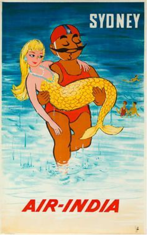
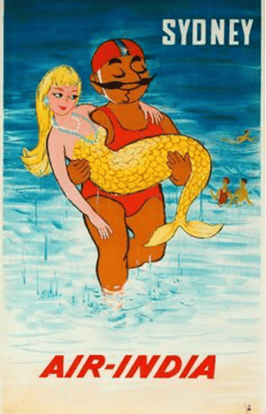
The prominence of Indian mascots’ history will at some point lead to the Maharaja of Air India – which recently has been the subject of critical dissection to understand not just its ornamental strategies but also the Indian heritage itself (source 11). Introduced in the 1940s, in post-independence India, Tata’s Air India gained the status of India’s national airline. To better represent the values of their brand (and perhaps India as well to all its foreign travellers), Air India released a series of brochures which starred a plump-looking man wearing a turban, representing a Maharaja of India.
The strategy was straightforward – represent India with a royal image which can be associated with great hospitality, attracting consumers to book an Air India flight to a popular destination. Within India, the Maharaja was seen in multiple holiday destinations from Sydney to Italy, from London to New York. When consumers saw someone like an Indian Maharaja saving a mermaid on the shores of Sydney, it resonated with their nationalist sentiments which were high after India got independence from the tyrannical British shackles.
This built consumer recall, so much so that Air India enjoyed an unopposed monopoly in the Indian aviation industry until the Government of India’s cyclic attempts to de-privatize and then re-privatize the airlines led to a mixture of financial troubles, ultimately leading to the recent demise of the mascot after the Tata Group took back the ownership of the airlines and concluded after expert consultation that the mascot is outdated (source 12).
Such empirical literature around the stories of mascots reveals that mascots are indeed created with psychological impact in mind. Hence the creation of mascots has its charisma, mannerisms and costume at the centre stage during its design process. While some mascots like The Michelin Man started as representing its brand as determined to provide a good time and then evolved into spreading across multiple generations by making guest appearances in children’s books and cartoons, Air India’s Maharaja wasn’t able to evolve with the time and tried to ride the wave of national pride for too long – the pride which started burning and spreading like wildfire throughout the 40s lasted till the 80s, but then quickly lost its embers as the next generation started seeking a more glamourous life.
The year 1969 was witness to the humble beginnings of a historic detergent brand named Nirma. It was started by a bloke named Karsanbhai Patel who, while working in the government office as a chemist, perfected a formula for a detergent with cleaning qualities superior to the available choices in the market (source 13). The origins of Nirma’s mascot have a lot of personal touch. The mascot was drawn by Patel’s daughter (the company is also named after her). This adorable origin story of the brand mascot warmed the hearts of the public and an affinity towards the brand was slowly being cooked up.
As Patel’s product started gaining traction in the 70s, he decided to launch ad campaigns via ad agencies to build a loyal consumer base. At the same time, technological innovation introduced Indian consumers to a new form of media consumption – the Television. The Indian broadcasting network was expanding its reach to rural areas of India and the folks at Nirma and their partners, launched one of the most memorable advertisements the nation has ever seen.
The advertisement was an instant hit due to its catchy nature, the brand mascot already had a heart-warming personal touch, but the masterstroke was played when the suits at Nirma decided to employ the emerging technologies of animation and combine the two into one brand film (source 14). The playful nature of Nirma’s mascot twirling and whirling before forming the static logo of the detergent and soap brand attracted kids and adults alike. It was indeed a perfect amalgamation of animation, copywriting, jingles and creative storytelling.
Parle-G has one of the most recognizable mascots in India (source 15). While Parle-G’s beginnings do not compare to the Nirma’s in terms of humbleness (source 16), it certainly doesn’t fall any short in terms of its brand perception, consumer reach and market share. Parle-G began its biscuit manufacturing in the year 1939 and directly competed in the confectionery market at a time when the only other alternative was British-branded biscuits. Since it was a time when the radical Indian independence movement had taken the centre-stage, Parle-G’s biscuit quickly became popular amongst Indian consumers. They were quick to play into the nationalist sentiments of the consumers by advertising nationalist propaganda (source 17). Until the 60s, Parle-G (back then their product was called Parle’s-Gluco) was the only Indian-based glucose biscuit maker available at affordable prices to Indian consumers, and hence the success that came to Parle-G’s founders was almost purely because of an early mover’s advantage (source 18). However, that quickly changed after the 60s. The retail markets started getting flooded with knock-offs, larger biscuit brands like Britannia jumped on the bandwagon to make glucose biscuits, and since the consumers associated Parle-G’s product with only glucose biscuits, the folks at Parle-G started to feel the heat. Being pushed into a corner and their company’s position under threat by big and small confectionery manufacturers alike, Parle-G initiated a re-branding exercise which witnessed the birth of the peculiar yellow package, red company logo and the plump little girl as their mascot. The new re-imagined packaging was an instant hit with kids and their mothers (source 19). Parle-G’s poster girl accompanied practically every single household’s high tea.
After consumer profiling, and understanding that kids are their target audience, Parle-G were quick to associate their brand and mascot with Shaktimaan which helped increase overall sales and bring some of the unfavourable regional markets, where other biscuit brands dominated, into Parle-G’s dominance. The brand continues to stay relevant in the new generation of memes and Instagram reels. A testament to this is Parle-G swapping their beloved mascot for an Instagram influencer whose reel crossed over 50,000 likes (source 20).
As the brand grew, the baby mascot featured on their packaging also grew. However, the success of the brand was not all about their mascot. While the mascot saved the brand in the 60s, when the brand was battling to protect itself in the market, by appealing to its target consumers – kids and women, the success of Parle-G’s dominance came with efficiently managing their manufacturing economics. For over 2 decades, Parle-G managed to sell their biscuits to Indian consumers at an unchanged price of Rs. 5/- even when the raw materials to manufacture them doubled. Parle-G depended on its product’s affordability and other marketing campaigns like that of Shaktimaan in Chennai (source 21) for its brand’s longevity.
It is undeniable that having mascots for brand building has been a strategy that has helped brands stay afloat during turbulent times. Mascots have been designed to best represent their brand’s values. Logos and names can never surpass carefully designed figures to represent a brand, like that of Air India’s Maharaja – which appealed to national pride, Nirma’s playful girl – which represented a humble family business with humane values, and Parle-G’s plump poster girl – which represented a healthy nutritious and affordable life. However, one of the biggest purposes that is being served by having mascots is having tremendous brand recall. The association of elaborate designs that dictate a larger story helps create a strong aura of the brand in the consumer’s mind that transcends into future generations. These characteristics ultimately help mascots prolong the longevity of the brand itself.
The extinction
Despite all the success mascots experienced in the 20th century, very rarely are we witnessing mascots as a strategy that modern brands use. In the past century, the buying experience of products and goods was limited to physical retail stores. The supply chain was set: there is a manufacturer, a wholesaler, a retailer and then finally a consumer – and all of them added value to the supply chain in varying ratios to keep the overall economy running. This was a fundamental method of conducting business throughout the 1900s. In the mid-20th century and early 21st century, limited media channels meant that consumers only had a few methods to consume information, and a constant repeat cycle of advertisements meant consumers were likely to remember mascots. Coupled with longer ad-spans creating a story and propagating it to the consumer became an easy task. This made mascots a common reference point in communities.
However, with the advent of Direct-to-Consumer (D2C) supply chain models, the way brands conduct business has been changing rapidly in the past 10 years. Companies are looking to make shopping a more personalized experience for consumers. They are doing this by tracking and analysing consumer behaviour patterns. Since 2012, the average time spent on the internet by an internet user has increased by ~70%. Consequently, the data trace left by the users on the internet has also substantially increased. Companies that keep track of these data traces, more often than not, feed the information to algorithms that run to analyse the user’s consumer profile, and then later recommend various goods and products based on its estimations and results. Technological advancements have become more liberalistic as they are centred towards the individual.
The mascots in the 1900s by nature were elaborate strategies that were deliberately designed to appeal to the masses. Their fundamental schematics were such that they would cover a wide range of emotions, and hence become as relatable as possible, for their target audience. Subsequently, with the changes in modern-day business models, mascots are finding it increasingly difficult to adopt a reliable strategy to deliver a profound consumer experience. Mascots now stand as a conventional strategy, that was once used by brands to represent their values and improve recall, now stand as idols of nostalgia for the older generations.